Career Tips
Creating A High Converting Landing Page – Easy Steps
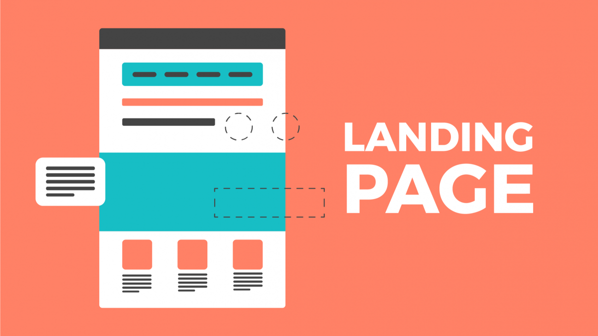
Many people’s first impression of your website is through its landing pages. If they’re not up to par, you may lose them before they have a chance to learn about what distinguishes your site and why it’s worth their time. Fortunately, landing page copy and design do not have to be complicated; we will demonstrate how.
What Is a Landing Page?
A landing page is a webpage that is intended to entice visitors and encourage them to take a specific action. Landing pages are commonly used in marketing campaigns and ask users to fill out a form, sign up for a newsletter, or make a purchase.
It’s the digital version of a direct marketing letter. It’s a standalone web page intended for marketing campaigns. A landing page’s purpose is to elicit a specific action through highly targeted copy.
Consider it a one-page website dedicated to achieving a single goal or outcome. It could be anything from attracting organic search traffic to generating leads or selling products and services. They are also an excellent option for lowering the cost of acquiring new leads or customers.
What Are Types and Forms of Landing Pages (Examples)?
About us Landing Page
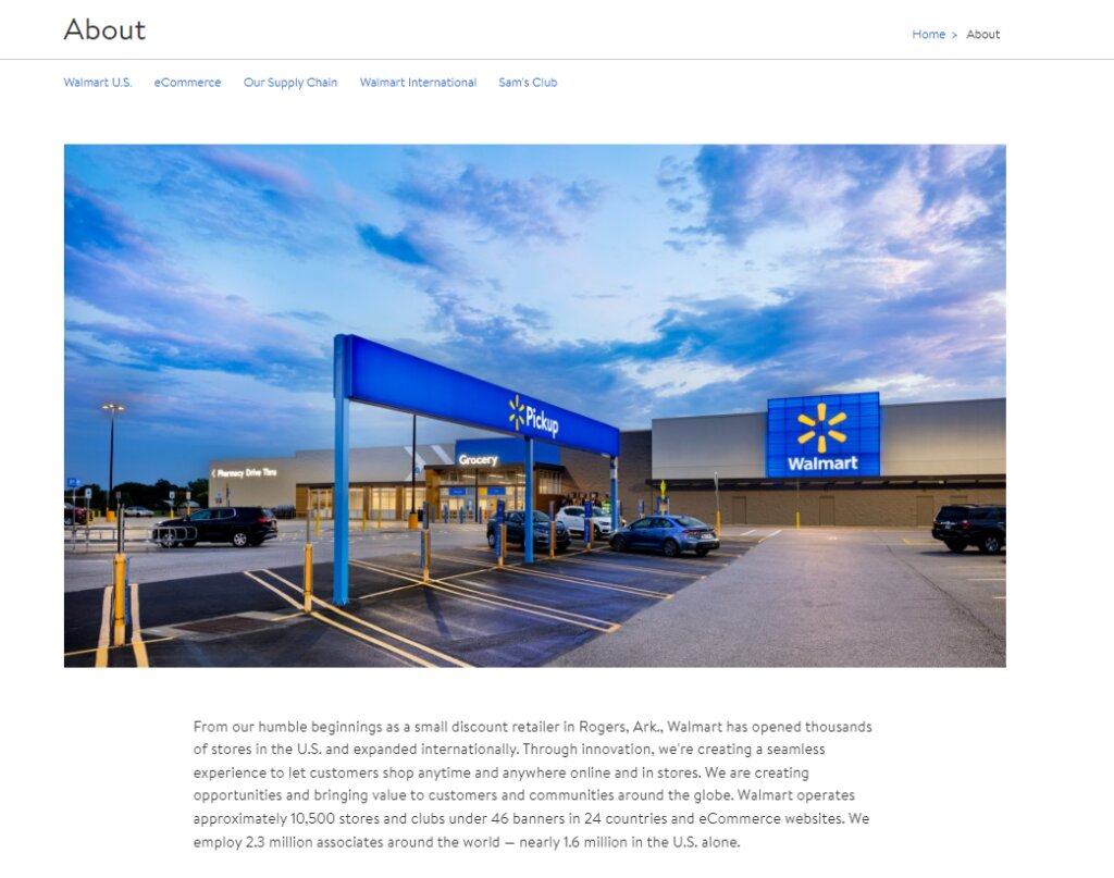
The About Us page typically includes information about who you are and what your company does, as well as contact information for the company. The about us page is often critical in establishing trust with your customers because it demonstrates that you are transparent and genuine in what you do. Visitors learn about the company’s characteristics through the presentation of its mission, vision, and history.
Coming Soon Landing Page

A coming soon page is a landing page set up to announce the imminent release of an item or service. Many companies – including the new ones, use these landing pages in their marketing strategy.
Some examples of coming soon pages include
1. A website demo – It is not complete but gives a sneak peek of what the website will look like. You can use this trick to attract interest and get people signing up for updates – so they know when it’s released.
2. New product launch countdown timer – this is great for adding urgency and making people come back to your website.
3. Mystery coming soon – you do not specify anything and arouse the curiosity to its fullest.
Pricing Landing Page
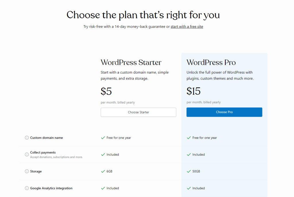
Companies unveil their price ranges and product offers on a page. Pricing pages have less content and are focused on scalability and minimalism. That way, visitors get the desired information at one glance.
Lead Generation Pages
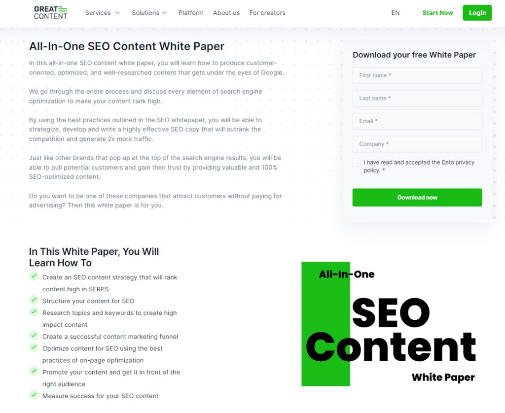
Lead generation landing page strives to capture visitors’ data and contact information to convert them into leads.
- Name
- Phone number
- Job title
Once you achieve it, you will create more targeted, personalized, and dynamic content. Also, you will nurture your leads through the marketing funnel and push them to purchase.
Splash Page
A splash landing page is a page designed to make an announcement or promote an event. The goal is to capture the visitors’ attention and direct them to the main event page.
A splash page is an intermediate web page that appears when a user clicks on a link from social media or another online content source. This page usually prompts the user for basic information such as age, language preference, and email address. Furthermore, many splash pages display an advertisement to the user when they click on it.
A splash page is an intermediate web page that is not intended for conversion. It is used for making announcements and promoting events. Splash pages are uncommon on websites looking for conversions because users are impatient and want to get to the main content. Splash landing pages will ask visitors about their age and preferred language.
Some features of splash pages include:
- Eye-catching headline
- Background image
- Small copy
- The registration form
Squeeze Page
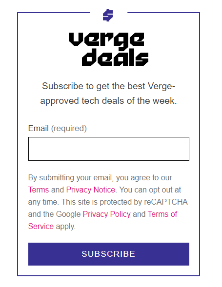
A squeeze page is a short landing page that only asks for an email address. A squeeze page’s primary goal is to collect email addresses and use them for future marketing activities. Squeeze pages include fewer images and text than other types of landing pages. Squeeze pages are typically designed as pop-ups to grab the user’s attention quickly.
Get Started Landing Page
Get Started Landing Pages help you take the first step with products and services. They usually have a form where you can enter your email address or other contact information to start using the product.
You will often see the instructions – videos, images, of
- How the product looks and works
- How they get the best out of it
- Testimonials and social proof from previous customers
Thank You Landing Page
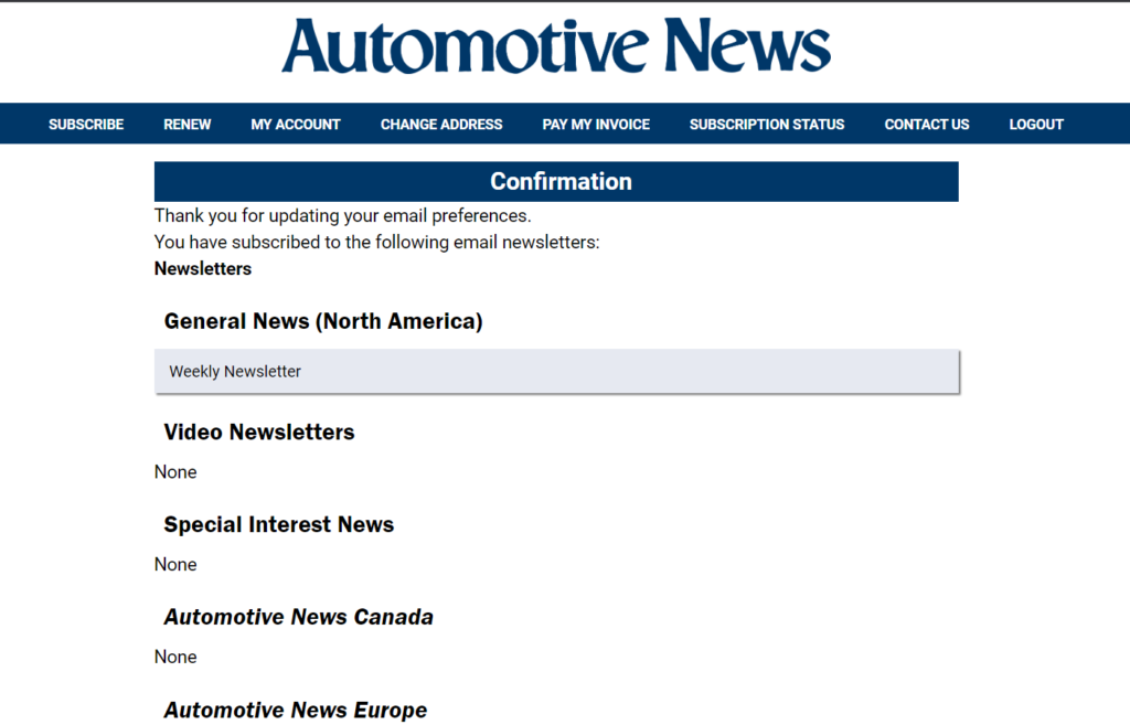
This landing page shows gratitude to customers for taking the desired action as signing up for the newsletter, reregistering at the event, and buying the product. It is the opportunity to make your relationship with customers even more personal and move your customer’s lead further down.
What Are Elements of Landing Page?
The primary and supporting headlines are the most important part of any landing page. These should be eye-catching and concise, indicating what users can expect on the page.
After the headlines, highlight your unique selling proposition (USP). Answer this simple but tricky question: Why should users buy from you rather than someone else?
Next, list the advantages of using your product or service. Demonstrating how your offering will improve their lives is an excellent way to persuade them to convert.
Once potential customers are convinced that your product is right for them, it’s time to provide social proof. Images and videos demonstrating how your product can help close the sale.
And finally, don’t forget to include a clear call to action so that users know what steps they need to take next!
What is the Goal of the Landing Page?
- Increase Search Traffic
Ensure that your content focuses on the right keywords. It will help you increase organic traffic and rank higher in search engines. However, SEO should not be your only focus; you should also evaluate the performance of your landing page and update your content as needed. Gaps in optimization can result in a loss of leads and conversions, so identify and close the gap!
- Make a Great First Impression
We call it the first impression, but it extends beyond that moment and shapes the overall perception of the brand. How you present yourself to visitors is extremely important. If you don’t manage first impressions, you risk losing potential customers who have opposing feelings and beliefs about your business.
- Promote Your Products or Services
A well-designed landing page can boost brand recognition and help businesses meet their marketing objectives. If you create an SEO-optimized landing page that appeals to your target audience, you will rank high on Google and promote your services without spending any money.
- Pull Leads and Increase Conversions
Increasing conversions is the ultimate goal of your marketing strategy. After all, if visitors do not become customers, your business will not grow.
So, you may visit a website and see a landing page that invites you to give away your email address in exchange for an e-book that provides instant solutions to help you build the organization’s structure. Once you download the e-book, the company will begin nurturing you with dynamic content to convert you into a customer.
There are also ranking service landing pages that persuade and encourage potential customers to schedule a meeting with a company representative and request a quote.
So, landing pages can attract qualified leads and allow the company to focus its content marketing efforts on converting them.
Get Data Insights Into Your Customers
Landing pages are a great way to get data insights into your customers. They tell you which content your audience likes and where they are most active. This information will help you build a more personalized content marketing strategy.
How to Create a Great Landing Page?
1. Define Your Goal
Before designing or copywriting your landing page, you must define your goal. Without a specific objective in mind, it is impossible to track your success or strive towards anything. So, what is your endgame? What do you want visitors to do when they visit your landing page?
- Subscription
- Getting the free trial
- Buying a product
- Downloading an e-book or a whitepaper
- Registering at the event
Once you understand the goal, you will better plan the upcoming process and have a direct focus on your objective.
2. Build the Landing Page Template
Now it’s time to start building or using a landing page template. This process will be much easier if you select an appropriate template – it will save you time. But, if you have the idea of exceptional landing page design, with placements, etc you can opt for this version too.
3. Write a Copy
For a high-converting landing page, the copy is twice as important as the layout. The words persuade visitors to convert, while the design provides support. To write persuasive landing page copy, you need to remember three key things:
Begin with your headline: The headline should be attention-grabbing and relevant to visitors’ needs.
Visitors do not care or understand the terminology used to describe your product’s features, so focus on benefits instead. They care about how the product will benefit them. Highlight the advantages of using your product or service. Make it simple: Keep your sentences short and avoid unnecessary jargon.
4. Add Images
Adding images to your landing pages can help boost conversions. Pictu helps you share your message without requiring visitors to read any text. Furthermore, high-quality product images will complement the background colors and provide a visual connection to the landing page copy. It is also critical to direct your visitor to exactly where you want them to look – and ultimately take action. The hero image should be professional-grade and include photos of people using the product/service to help visitors connect with your offer on a more personal level. Finally, always assume that visitors are busy and present them with a visual story that they can quickly absorb.
5. Form Clear Call to Action
When creating a landing page, it’s essential to have a clear call to action (CTA). What do you want visitors to do on your page? You already have defined this point in the initial phase of landing page planning. Take a look at your goals and use them in your CTA.
6. Landing Page AB Test
AB testing (A/B testing) compares two versions of the same page. You create a modified version of your landing page with one difference: the headline. You direct half of your landing page visitors to the original version and the other half to the modified version. Data is compared after a test run is finished. If the change is positive, you can use the modified version as your new primary landing page.
7. Don’t Forget Branding Elements
Match your branding elements to those that are already appearing on your website. Include the same color, logos, and fonts. You don’t want to confuse people about where they currently landed and with who they interact.
8. Preview and Publish
Take a closer look at all the completed tasks:
- Check spellings
- See how images fit on the landing page
- Make sure that branding elements are on-point
- Look at pricing – are they correct?
- Edit the copy.
What Are Best Practices for Landing Pages?
Prioritize and Add Important Message Above the Fold
Always place the lead form above the fold so that visitors can see and read your important message right away. In addition, you should design your form so that it scrolls with the user rather than forcing them to scroll down to fill out the form. It ensures that all of your visitors can provide their information without having to search for the form on the page.
Write a Headline that Showcases Benefits
When creating a landing page, it is critical to include a headline that highlights the benefits of your product/service. After all, if customers don’t understand what they’re getting, they won’t buy.
There are various headline formulas for different use cases, but almost every headline follows the same general rules. Some things you should remember when writing headlines include:
- The headline should be clear and concise while conveying the value.
- The page’s content should be clear even without reading the accompanying text.
- Test various headlines to determine which ones work best for your target audience.
Optimize for SEO
An SEO-optimized landing page is a website that improves the user experience and drives high traffic, engagement, and conversions.
To optimize your landing page for SEO, keep the following points in mind. – Concentrate on writing a compelling headline that will draw in users looking for a specific answer. – Use your keywords throughout the text, title, and URL. – Create meta tags that target users searching for specific content on your page.
When it comes to SEO, the title tag and meta description are two of the most important elements. The title tag appears as the blue link in search engine results pages, so make sure it accurately represents the content of your page. The meta description allows you to summarize the content on your page and entice readers to click through to your site. The title tag and meta description should be approximately 60 characters long.
Design Simply
Focus on creating a simple design for your landing page. Too much information can be overwhelming for the consumer, so less is more when it comes to branding. Some of the world’s most successful brands use simple designs to reinforce their identities in the minds of consumers. Apple, Coca-Cola, and Nike are all iconic brands that use simple graphic designs.
Simplicity in branding communicates messages more effectively than complex designs. According to cognitive theory, people prefer simple options over complex ones. Basic visuals are easier for our brains to process.
While simple does not have to be boring, it should also not be confused with intricate or involved. Simple logos and designs can evoke strong emotions, memories, and aspirations, allowing for more sophisticated marketing strategies to be used.
Include Case Studies and Social proof
Social proof is the psychological phenomenon that occurs when people observe others taking actions they deem similar to their own- in other words, visitors are more likely to take any action if they see that others have done so before them.
There are many types of social proof on your landing page:
- Testimonials from happy customers.
- Case studies of how your product was successful.
- Customer ratings and reviews.
- Even just logos of brands your visitors will recognize.
But where should you place this social proof?
Studies show that the best spot for social proof is near the call-to-action (CTA) button. This way, people can see how many others have taken the desired action and be more likely to do so themselves.
Make Your Landing Page Mobile-Friendly
People are increasingly accessing the internet through their smartphones. That’s why it’s critical to make your landing pages mobile friendly. According to recent studies, mobile platforms account for 1% of all global website visits. That may not appear to be a large number, but when you consider the number of people who use smartphones around the world, it becomes significant.
Landing page optimization for mobile devices is becoming increasingly important as more people use them to access the Internet. Mobile optimization allows you to increase conversions by making it easier for visitors to complete the desired action on your page. Even if you’ve already begun optimizing for smartphones, mobile optimization techniques can benefit all landing pages.
There are three ways you can improve your landing page visitors’ experience on mobile devices: Mobile site viewing, text size, and screen size. Let’s take a closer look at each one.
Insert Easy to Fill Forms
Make it shorter for visitors to fill out so, your customers are not lazy to fill the forms. Longer forms packed with multiple fields tend to have a low submission rate.
What Are Landing Page Builder Tools?
- Unbounce
Unbounce is a tool that lets you create landing pages with just a few clicks. It is designed for marketers using content marketing and social media as their core marketing tools.
- Clickfunnels
Clickfunnels is a tool that helps businesses create and manage landing pages for their campaigns. This software allows marketers to create, test, and implement landing page marketing strategies for their businesses.
- Leadpages
Leadpages is a tool for designing high-converting landing pages, squeeze pages, and sales funnels. Leadpages offers three packages at various price points to meet your needs. Leadpages is an effective choice for both small and large businesses seeking to increase leads and conversions.
- Hubspot
Hubspot is the leading marketing software platform that enables marketers to create, track, and optimize digital marketing campaigns. Hubspot’s landing pages are intended to help users understand what type of content they need to create on their website in order to increase conversions and sales.
FAQs
- What Is a Difference Between a Homepage And a Landing Page?
A homepage is the main page of a website and includes general information about what the site does. A landing page is typically used to capture potential customers with a call-to-action and some limited information about the main site.
- What Is a Difference Between a Landing Page and a Sales Page?
A sales page is a web page that contains information about your product and how it can benefit the customer. A landing page, on the other hand, has all of its focus directed toward the call to action.
- What Is the Point of Creating the Landing Page?
A landing page is a webpage that aims to convert visitors into customers. The purpose of the landing page is to provide your users with an informative and appealing experience that will persuade them that they require your product. The complexity of landing pages varies with the project’s size and type.
The goal of creating a landing page is to encourage users to visit your website and fill out their information so that you can contact them about a product they may be interested in.

